


Hello! Wish you a happy new year and a great year ahead. Hope you had a nice break in the holiday period. Since everyone is reflecting on what they learned last year and what new things they want to learn in this new year, let's throw some light on VOTD visualizations of December 2020. In December, 21 visualizations were selected in VOTD, 7 more than the last month (read about Nov' 2020 VOTD here).
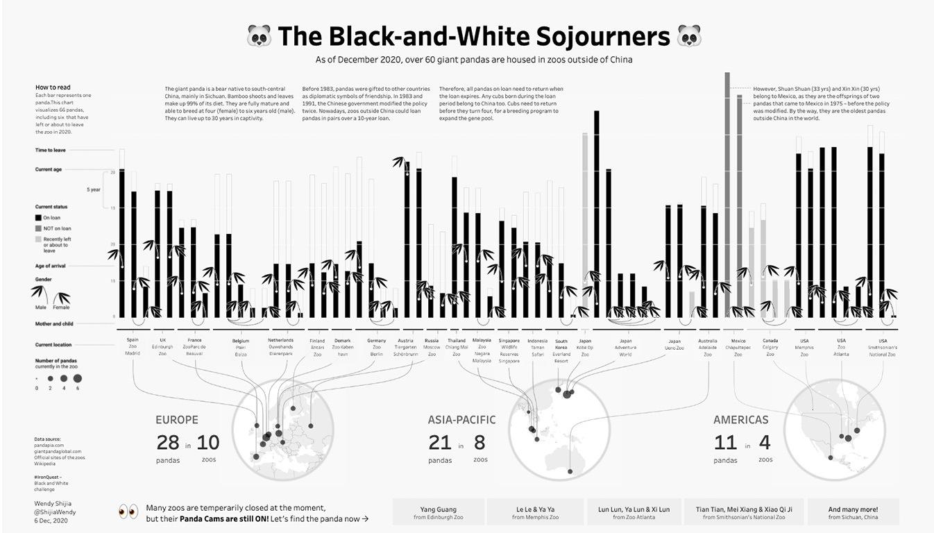
Wendy Shijia (Twitter) shared a very interesting viz on 6th December. She shared a story about pandas, how many are there which are on loan and outside China. Wendy used many interesting tricks in this viz and it was fun digging into it. I learned a lot of new stuff such as mimicking bamboo sticks, how she presented male and female pandas, the curve lines from the map to bar graph, and transparent png images for links. Check out the viz here.
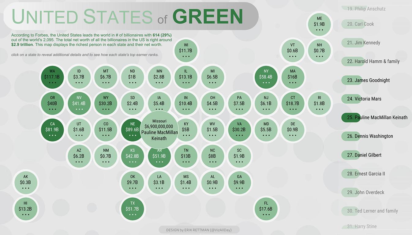
The second most interesting Viz, according to me, was published by Erik Rettman (Twitter). He did a very clever job of creating a special calculation using parameter action along with animation, gives the effect of scrolling which looks so amazing. Dig this viz here.
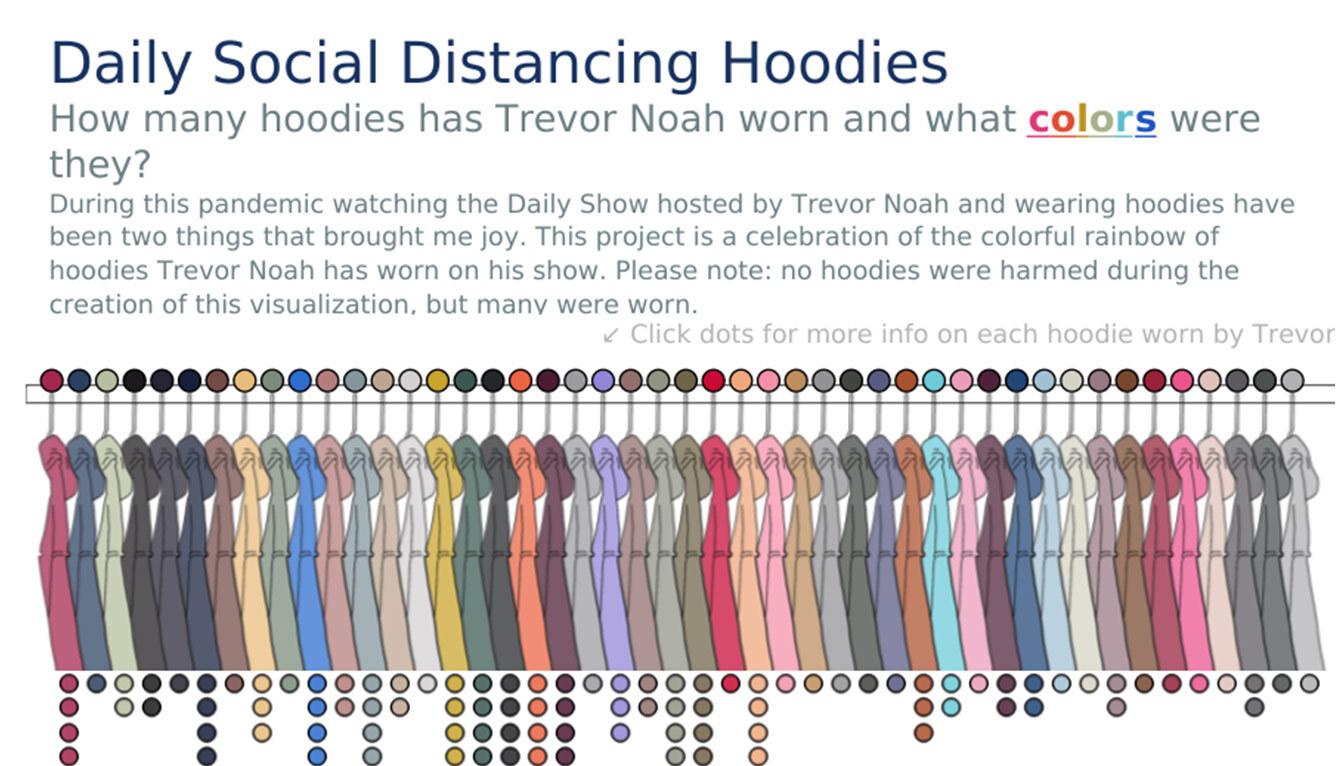
The third on my list is one selected on 2nd December, published by Chris DeMartini (Twitter) who is also a Zen master. In March, Trevor Noah began filming The Daily Show from his apartment. Chris DeMartini visualized the color, saturation, and hue of each hoodie worn by Noah. This viz looks simple but I was surprised to see so much complexity in the workbook. There are a lot of pieces that are combined to create this viz. In it, 13 sheets are overlapping and creating a nice view based on data. Chris used many different techniques in it and created all the components with data, which includes circles, curved paths, arrow marks. This viz is very inspiring and you should dig into it. Link here.
As there were many interesting Vizes this month, I have 2 more vizes to talk about. The fourth on the list is published by Bo McCready (Twitter). His viz is about every World Cup goal scored by the USWNT from 1991-2019. This is a very simple but different way of showing the data points. He also used a simple pie chart for each of the world cups, and it looks very nice. Check it here.
Fifth on the list is the last VOTD of the year, published by Zen Master Ken Flerlage (Twitter). He published a very beautiful viz and mapped the very simple population data with shapes and dark maps. It is inspired by Pic of Night on Earth by NASA. Ken mimicked the pic to show the population across the globe. Check it out here.
Congratulations to all the VOTD winners of December 2020. Wonderful stuff. Wish to see a lot more from you and the complete datafam community in the New year.👏
Post a Comment