
Looks like this challenge was of moderate difficulty. Let's start with the challenge.
First, create a calculation for Cost.
SUM([Sales])-SUM([Profit])
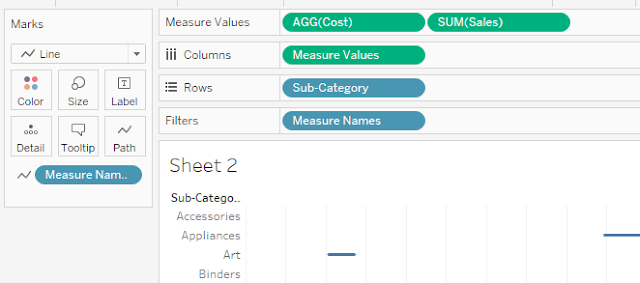
Add Measure Values to columns and add Measure Name to filter.
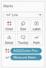
Create a calculation for Coloring the Lines.
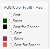
Color Profit
SIGN(SUM([Profit]))
Change it to Discrete, and drag it to the Color Marks Card.
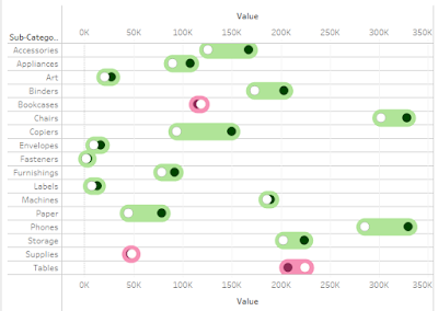
If you replace Color Profit with Measure Names, it will work for the first requirement (Level 1) where you do not need any border or you can keep the same border for both the circles. If you want to stay with Level 1 Continue to the next step, but if you are trying to create level 2, there is an extra step in between.
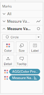
Extra step: Create a duplicate calculation of Cost with the name [Cost for Border]. And add this calculation to the Measure Values along with Cost and Sales. Also, add [Color Profit] calculation to the color card of 2nd Measure Values along with Measure Names. Now there are 2 color pills on the 2nd Measure Values color card. (How to do this: First add [Color Profit] to Details, then click on 3 dots next to the [Color Profit] Pill and change the type to Color.)
Now a few more steps to achieve the view: Make both the Measure Values as dual-axis, Synchronize Axis, Adjust the color of the Measure Values, Adjust the size of line and circles. And you are 95% done.
The last step is to add a centered line to all the Subcategories. If you have noticed, the default table structure is to have lines above and below the categories (Called Column Dividers).
To achieve this, Create a min(0.0) calculation in rows. This will give you an axis as a 0 line passing from the center of the Subcategories name. Now you can hide the table Dividers and do some formatting.
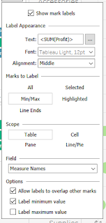
Finally, do the below settings for your labels.
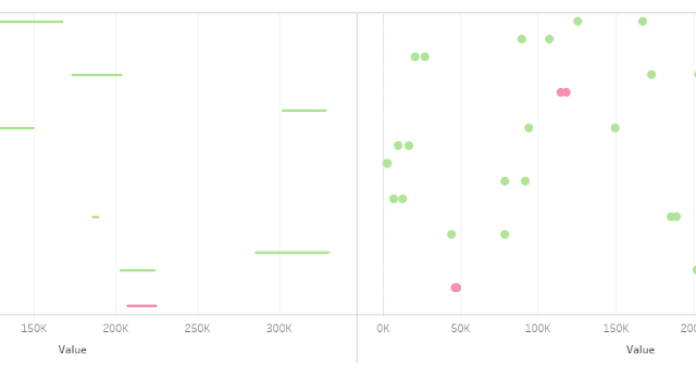
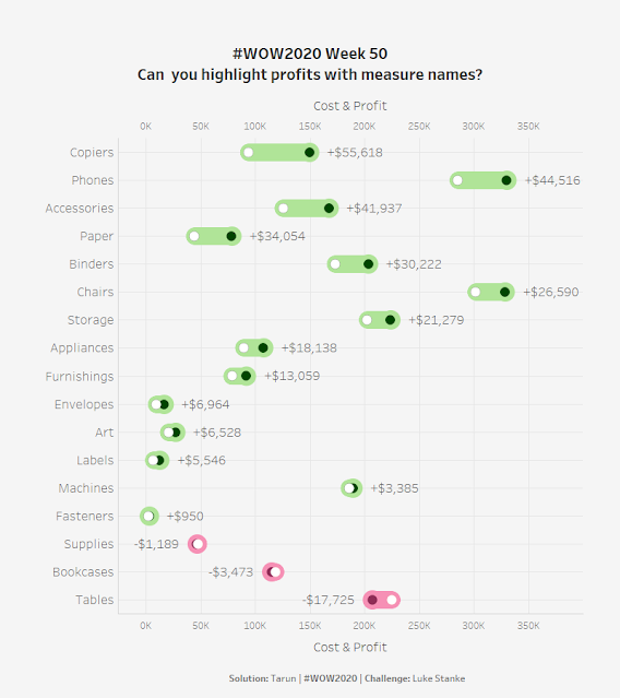
This is your final view. Check the visualization here.
Post a Comment